
Paisa Logr
Designing a mobile app that helps young adults effortlessly track and organize their personal expenses.
Detailed Case Study : PaisaLogr

Overview
| Role | Product Designer — research, UX/UI, prototyping, user testing |
| Product | PaisaLogr, a mobile expense-tracking app |
| Audience | Young adults tracking day-to-day and event spending |
| Tools | eraser.io (low-fidelity wireframes), figma (designing and prototyping) |
The Problem
Losing track of everyday spending
Young adults often overlook small daily expenses and struggle to organize spending across different events like trips, outings, and celebrations — making it difficult to understand where their money goes.
The Challenge
- Encourage young adults to build a consistent expense-tracking habit.
- Reduce the effort required to log expenses, making tracking quick and intuitive.
My Role
As the Product Designer, I was responsible for understanding user needs through research, designing intuitive user experiences and interfaces, creating interactive prototypes, and ensuring the app provided a seamless, effortless experience for tracking personal finances.
Product Discovery
Competitive Analysis
We conducted a competitive analysis of the most widely used expense-tracking apps to understand their strengths, identify usability gaps, and uncover opportunities for improving the overall user experience.

Key opportunity
Design an expense tracker that prioritizes simplicity, speed, and contextual organization over feature complexity.
User Persona

Research Insights
Three recurring problems surfaced from research:
Small expenses go unnoticed
Small, frequent purchases are easy to forget, making it difficult for users to understand where their money is actually going.
Existing apps feel complex
Many expense trackers prioritize advanced features, making quick expense logging feel time-consuming and overwhelming.
No context for spending
Users struggle to separate expenses for trips, outings, or special occasions from everyday spending, reducing financial clarity.
Design Goals
- Effortless logging — make expense entry fast enough for daily use.
- Context-first organization — group expenses by trips, outings, and events.
- Habit building — encourage a consistent tracking routine.
- Clarity at a glance — present spending insights through a clean, intuitive interface.
Ideation
Big ideas that emerged during the brainstorming session:
Event-Based Organization
Dedicated spaces for trips, outings, festivals, or any personal event — keeping related transactions together for better context and budgeting.
Visual Spending Insights
Represent spending through charts and visual summaries, helping users quickly understand where their money goes without reading long transaction lists.
Financial Awareness Cards
Bite-sized educational tips and insights that encourage smarter financial habits and better money management over time.
Feature Selection
Each "How might we" question from research was mapped to a core feature:
The Solution
Introducing PaisaLogr a fast, context-aware expense tracker.
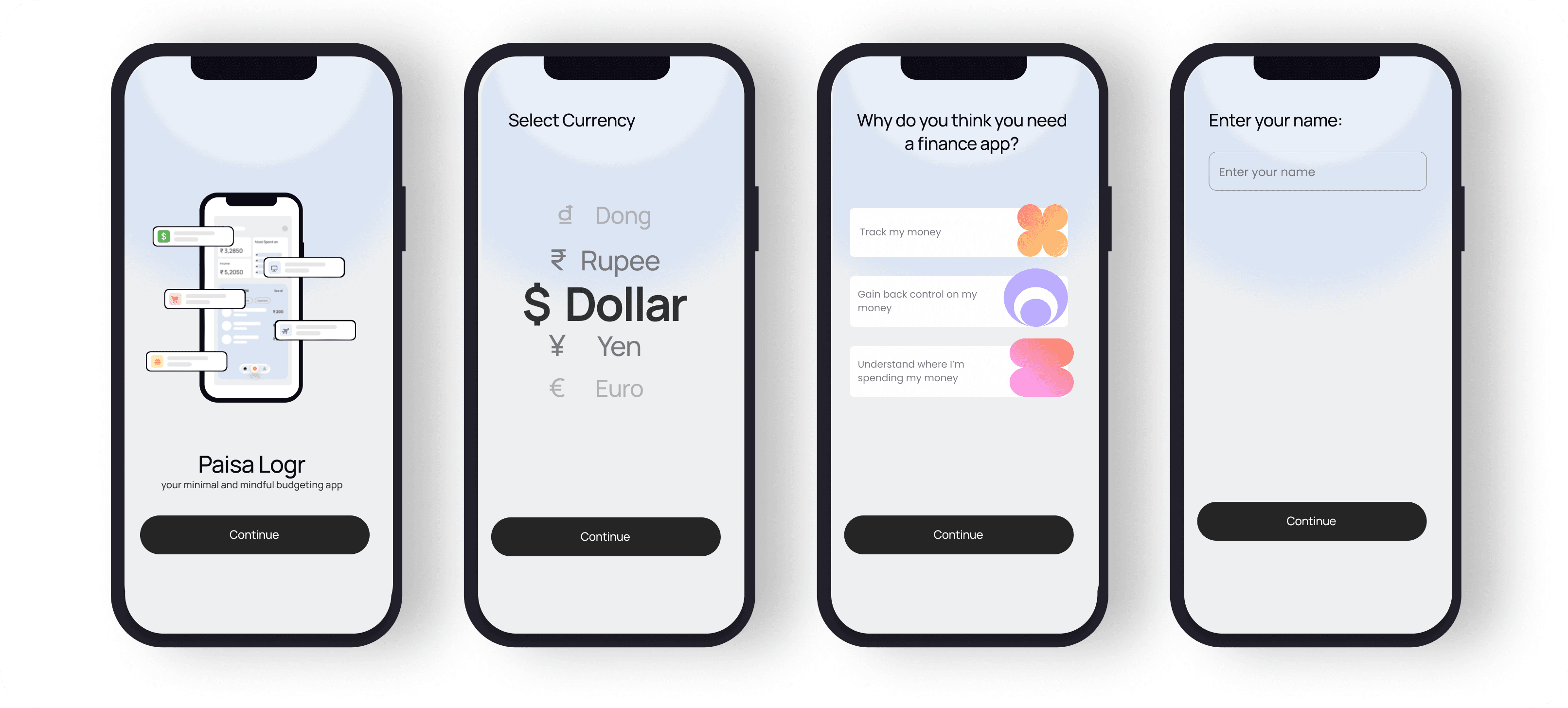
A short, focused onboarding flow that users understood quickly in testing.
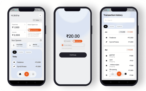
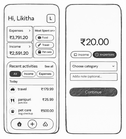
The home screen leads with income, expenses, and top spending category, followed by recent transactions and event-based Spaces — key information without navigating through multiple screens.
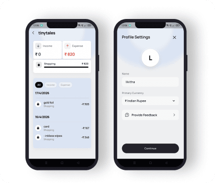
Spaces keep trip and event spending separate from everyday transactions, with profile settings kept minimal.
UI Design Process
Iterations & User Testing
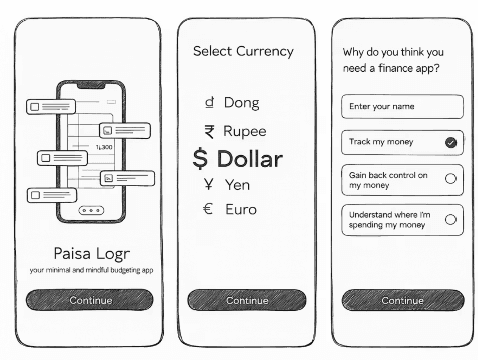
Low-fidelity onboarding iterations
Round 1 explored the onboarding flow through quick wireframes built in eraser.io.
Choosing the essential tabs
We tested which tabs were essential to keep the interface simple and easy to navigate.
Home screen layout
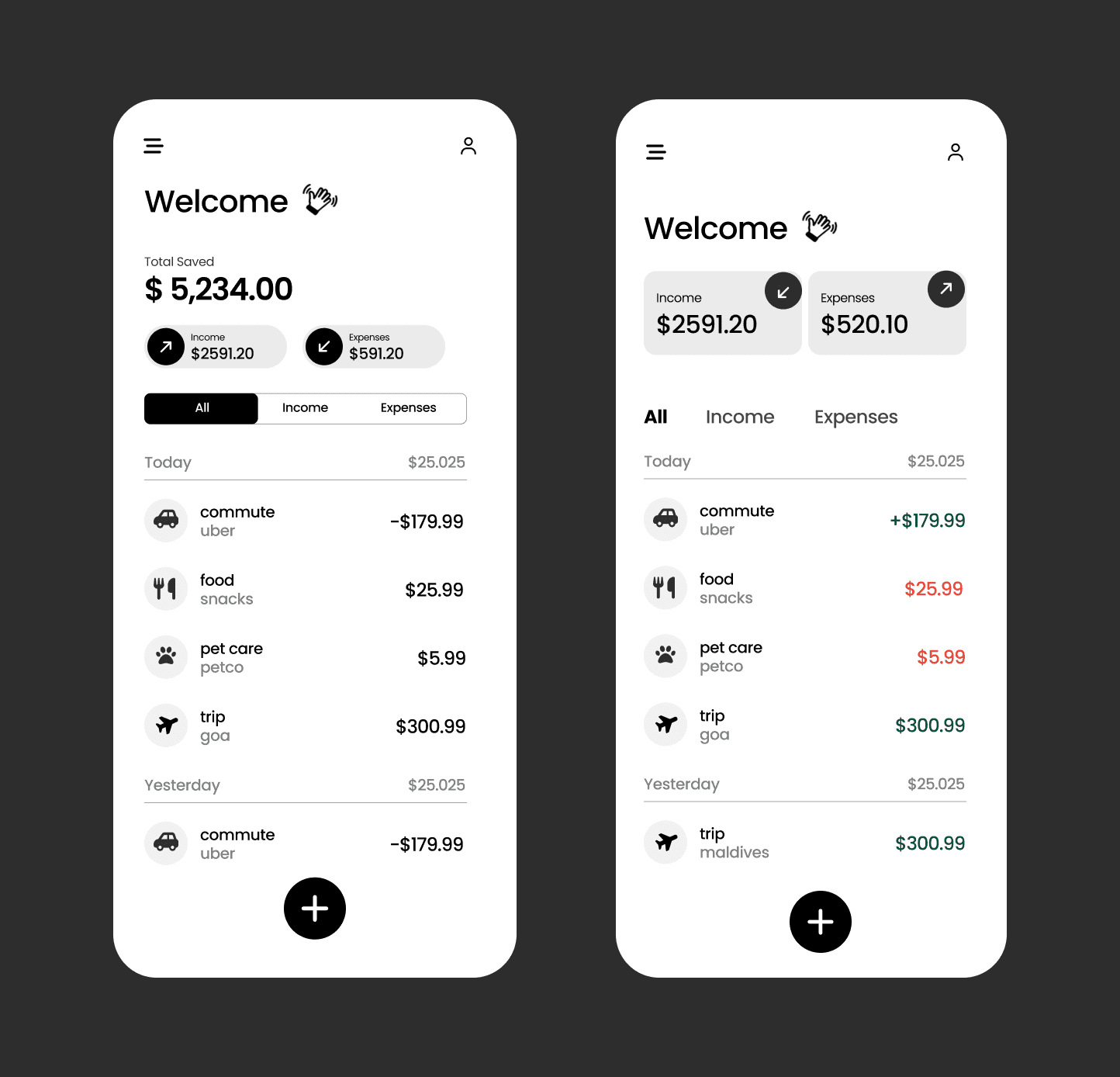
We compared layouts to find which screen enables users to quickly scan key information while reducing cognitive load — cutting unwanted information in favor of a card view.
The final hierarchy: a quick scan of income, expenses, and top spending category, followed by recent transactions and event-based Spaces.
Testing Results
- Users quickly understood the onboarding flow.
- Event-based organization made expense tracking more meaningful.
- The Home screen provided a clear overview of finances at a glance.
- Users preferred a minimal expense entry flow with fewer steps.
- Visual spending insights helped users identify spending patterns faster.